This website is not financial advice. Posts may contain affiliate links from which I earn commissions at no additional cost to you.
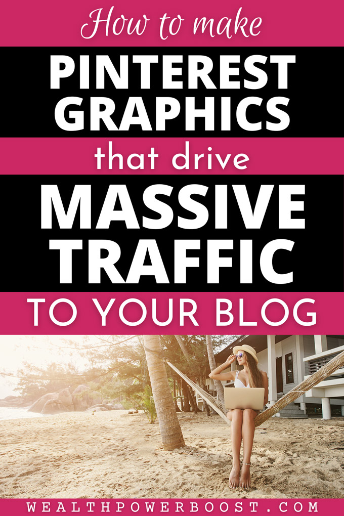
How To Make Pinterest Graphics That Drive Massive Traffic To Your Blog – Graphic © WealthPowerBoost. Background photo – Shutterstock (under license)
This tutorial will show you how to create Pinterest graphics that blow away the competition! 🙂
Introduction / Getting Started
After 8 years of doing this; creating and testing thousands of images and generating millions of visitors (yes really millions, I am not exaggerating) from Pinterest to my 20+ blogs, I think I can safely say that I have identified the key factors that go to make up a successful Pinterest graphic… 😉
For this tutorial I am going to assume that you / your graphic designer have the required technical skills to operate Photoshop, Canva or whatever design platform you are using. (If you are totally new to creating graphics – use Canva. Canva rocks. I love it. I used the free version of Canva to create the above graphic!)
Good news: You don’t need to be a college-educated graphic design pro to do this! I’m completely self taught in graphic design (using both Adobe Photoshop and Canva) and have created graphics that got millions (yes really) of shares.
No disrespect at all to pro designers – but the nuances of what go to make a successful social media graphic are not necessarily the same as the kind of graphic design that may be taught at college. Social media graphics that get massive traffic are a specific skill set and an art form in their own right – and this is what this tutorial is about!
Related Post: How To Make Money On Pinterest (full tutorial)
Traffic Equals Money
Generating traffic is the lifeblood of an internet based business. You may have heard the expression “traffic equals money” and it’s true.
I have multiple blogs pulling consistent traffic from Pinterest and these deliver an ongoing passive revenue stream. Here’s an example of the traffic on one of them:
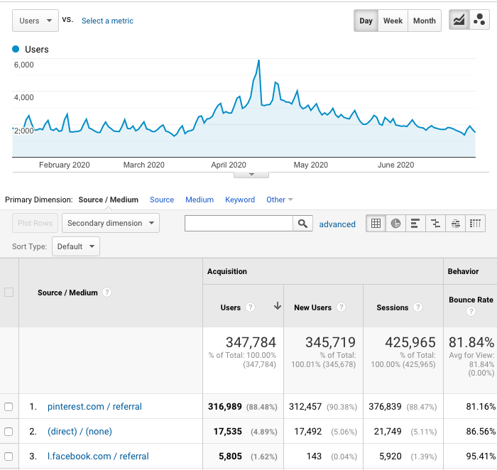
This is a screenshot from the analytics of my recipe blog. You can see how traffic always spikes on the weekend, when people spend more time cooking. The “bump” in the middle was when the lockdowns started in 2020 and restaurants were closed!
Good graphics make a huge difference to your Pinterest traffic: You can create pretty much any image (that doesn’t break ToS of course) and pin it on Pinterest; however some images will generate crazy traffic and some will not. You need the RIGHT kind of images and there is an art and science to this. The VITAL thing to understand is how to make the kind of image styles that are going to get a lot of clickthroughs and repins.
Stand Out From The Pack
Put yourself in the mindset of the average Pinterest user who is ‘consuming content’. They are most likely either searching for content on a specific topic, looking at themed boards on topics they love, or randomly scrolling through images related to something they just looked at.
In every case, your pins are going to be presented by Pinterest in a “sea of pins”. Pinterest will notice which of those pins get the strongest engagement and will display those images to more people.
So making images that stand out from the pack and get the click is essential. Your images need to “pop” in a big way and for best results you need to understand what makes an image pop – then max out those characteristics.
The most successful Pinterest images tend to have one very strong hook that grabs the eyeballs immediately. Typically this hook will be either huge “power words” or a very compelling image (this image could be either an illustration or a photo).
Note that compelling images don’t necessarily have to be beautiful. They can be compelling because they are bizarre, unexpected or confusing: One of my most successful Pinterest images ever, featured a bright amber-orange colored blob of resin oozing from the trunk of a tree… I am sure its viral success is because it generated massive curiosity – the “What the heck is that?” reaction. It’s impossible to ignore.
A Bit Basic And “In Your Face” Often Beats Elegant
Note, interestingly, that ugly images can sometimes do really well. It has to be “the right kind of ugly” though. Super elegant graphics can get lots of repins but just don’t seem to drive traffic as well as graphics that jump off the page and grab you by the scruff of the neck.
Youtubers have learned that a wide-open mouth photo – even to the point of absurdity – grabs more attention than a photo of a person with their mouth closed. Look at “Mr.Beast” Youtube thumbnails for a perfect example of this.
You can see that the main graphics on this blog are intentionally bold, high contrast, somewhat “in your face” styles – with the most important words of the headline ramped up to a huge size…
Interestingly also, sometimes “amaeturish” (in the right way) looking graphics can have great appeal. The reason for this is psychological: If you are “super fancy”, it can be a bit unintentionally intimidating; leading people to “exclude themselves” subconsciously. Whereas (I hope this doesn’t sound terrible but it’s really true) if you come across “a bit basic”, people conclude “this person doesn’t exactly seem like a genius – but they are crushing it, which means I can do this too!” *click*…
Big Headlines Rule
Putting your headline into the graphic is a tried-and-tested tactic that works extremely well on numerous social media platforms. I discovered this in 2013 and it’s an absolute key factor that I’ve been using ever since. I’ve had “headline graphics” send so much Facebook traffic (over 260,000 pageviews in one day) that they crashed my VPS hosting; and once had a headline graphic earn me enough money in one weekend to buy a BMW – which I did (true story!!)
The first thing to note is that your headline should be a winner in its own right and should be displayed in a very large, clear, easy-to-read font, typically together with one or more attractive images – however sometimes “just the words” can work well too! Your logo should be in there somewhere but it can be v small and unobtrusive, because most people are not really too concerned about that at this point.
Make the words way too big. Then double that. Then make them a bit bigger still. And then they will be nearly big enough. 😉 You get the picture… Make your images with monster size words and lay them out clearly – because then your image just jumps out more than 99% of what is on the screen. Content creators are catching on now and you can see “big word” graphics all over Pinterest – but remember also that the majority of people simply don’t do this and never will, so you get an immediate, big advantage!
Now let’s look at how to arrange your headlines and words for maximum effect.
Vary The Word Size, The Right Way
You can see also that I put the “power words” in big, capitalized fonts, with the less “important” words minimized. This is deliberate too! When people are scrolling, they have a minimal attention span. A big block of uniform text is “too much” for the brain to process at first glance. Their eye is going to go naturally to something that is quick to comprehend and speaks directly to their needs. My graphic here was optimized so that the person scrolling on Pinterest will see “PINTEREST GRAPHICS” “DRIVE MASSIVE TRAFFIC” first. That’s the “hook” – as “bite sized” as I could make it! Then there is a second stage of comprehension, where they take in the rest of the headline, the other elements and make a snap decision “is this for me”?
Phrasing And Word Clusters
Note also that my headline wording is carefully organized so that the “flow” of the phrasing is natural:
How To
Make Pinterest Graphics
That
Drive Massive Traffic
To Your Blog
reads much easier than
How
To Make Pinterest
Graphics That
Drive Massive
Traffic To Your Blog.
Can you see the difference? This is more important than people realize!
Read your headline out loud – and take note of the natural tendency we have to “group” words into small clusters. Then organize your headline visually according to those clusters. This “natural phrasing” will help with at-a-glance comprehension – which is vital to grabbing attention!
Use More Than One Font
You can see that on all my main graphics for this blog, I use more than one font. That’s deliberate. I don’t know why, but it seems to add appeal and “just works”. Try using a blend of “handwriting” and bold sans-serif fonts. Handwriting fonts have a “friendliness” to them that is inviting and gives a flourish to “round off the edges”. Try also using a blend of lower case and capitals. If you exclusively use bold capitals, it “sounds like you are shouting” and that can put people off!
For the above graphic, the fonts I used were Euphoria Script, Open Sans Extra Bold, Josefin Sans Regular and Courier Prime (for the logo at the foot). The free version of Canva includes lots of super great fonts that ‘just work’ so explore and try some out until you find a ‘flavour’ that you feel represents you well and has the right vibe. 🙂
Lists, Numbers, Percentages And Brackets
A simple tried-and-tested headline formula that perennially works well is the “numbered list”. You can see these all over this blog. That’s deliberate! People love numbered lists. Strangely, researchers have found that odd numbers get more clicks than even numbers. I’ve no idea why.
How big should your list be? For some list-style blog posts, a very large list works well i.e. 80+ Ways To Make Extra Money – because that is indicative of a really high value resource. A “Top 10” list suggests a fun but informative post. However a small number (try 3,5 or 7), combined with a sense of urgency, suggests that the post will be a quick, low-commitment read but contain vital info; this can get tons of clicks too – for example something like “The 3 Things You Must Know Before You ___________” (try that headline! 🙂 )
In all the list graphics on this blog, you can see that I made the numbers really big on the page – bigger than the words – and put them in a circle of the opposite color, to make them jump out even more.
Percentages, specific amounts of money (be honest though, because that’s actually extremely important for legal reasons) and brackets, have all been shown to increase headline clickthrough as well and have all generated viral traffic for me. My God, am I really telling you all this for free? 😉 You don’t even know how much money this made me.
[for more on headlines, I will post a power headline tutorial very soon].
Optimal Pinterest Image Sizes / Image Ratios
The next thing to note is the image size and dimensions. TLDR: Make your images 600×900, 800×1200 or 1000×1500. These are “tall” images with the height 1.5 times the width.
Here’s an example of how a well-crafted Pinterest image stands out:
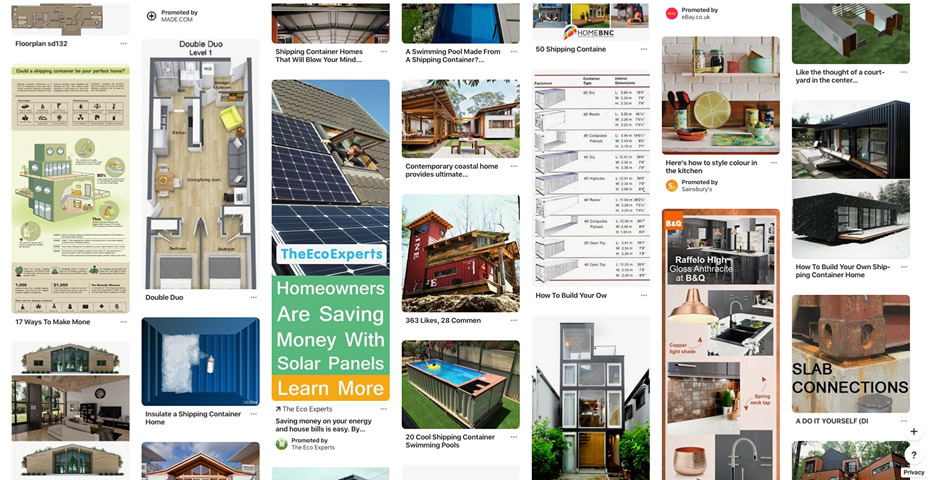
This is a generic Pinterest “More like this” section. Which of the images in this screenshot stands out the most? Easy – the “Eco Experts” image!
You can see that in the “sea of images”, The Eco Experts not only have the biggest wording and most eye catching high-contrast colours, but they have the tallest image – which makes it about 3x as visible as the others!
This is important to understand. Because of the way images are displayed on Pinterest, with the image widths standardized and the heights variable, Pinterest naturally awards tall “portrait” images more overall “pixel real estate”. They simply take up more of the screen! Hardly anyone will notice a flat “landscape” image on Pinterest – because these are given a tiny amount of the screen and just don’t stand out at all.
So make tall “portrait versions” of your images and you will get more Pinterest clicks!
Not too tall, though. The height ratio needs to be in the zone: If you make your graphic super crazy tall, Pinterest automatically cuts off part of the image when it is in the feed! Pinterest themselves stated that super tall “skyscraper” images get less visibility from Pinterest’s algorithm – to stop people abusing this quirk of the way Pinterest displays images. We researched it and the maximum size ratio before it cuts off some is 1:2.1 – though note that this figure seems to change often.
I have done well with images that are between 600×600 (square) and 600×1260 and I think anything within this ballpark should be fine.
For years the optimal image size for Pinterest has been regarded as 600×900. Pinterest is now actually recommending 1000×1500 when you upload pins directly; however this is a hassle – because if you post an image at that size on your blog, it will load WAY slowly because of the massive file size – and Google for example uses page load speed as one of its ranking factors! Pushing up the recommended image size to 1000×1500 was in my view a horribly shortsighted move by Pinterest… but it is what it is. I’m still posting 600×900 images – and my old 600×900 images are still getting traffic. I’ve tried using 1000×1500 images and didn’t notice a difference in traction so far.
Tiny images – whether tall or flat – are not advised at all. I would say use nothing that is less than 600×600 pixels as a general rule of thumb. Images need to be more than 80 pixels in size to be picked up by Pinterest’s “pin it button”. Thumbnails won’t be found – for good reason. Also note that anything within flash sites or frames cannot be picked up by the Pin It button and shared on Pinterest, neither will web page “backgrounds”.
One Awesome Graphic Will Outperform 10 Average Or Weak Graphics, Every Time
Focus on quality first, quantity second. A good graphic doesn’t have to be complex, but it has to have the right attributes. Make it your goal to create graphics that are going to be big winners first, rather than just trying to crank out a gigantic number of run-of-the-mill images.
Let’s look in detail at some examples of good and bad Pinterest graphics:
Max Out The Appeal (Good And Bad Examples Below!)
Now this (below) is a GREAT pinterest graphic, and look – 20k repins, which is MEGA. They paid some bills with this graphic 😉
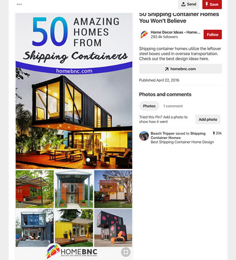
Image – homebnc.com
Whoever made this graphic was a Pinterest pro (and a real estate pro, I’ll bet). It has all the hallmarks. They made the whole thing very appealing and it really sparks some excitement.
Note how they laid out their photos. There is one well-chosen “show piece” photo that has the wow factor, with that classic industry-standard “real estate golden glow” that is artificially added to make an interior space seem warm, cosy and inviting. Then there are a few small pics underneath, that you can’t really see, and so it makes you want to click them to make it bigger. I’d say that’s deliberate! Also, you think, hmm, the headline says 50 altogether, but I can only see 7 thumbnails. That means there are many more in their article! This adds to the curiosity too.
Grabs attention → makes sense quickly → appeal generates desire → sparks curiosity = they got the click and the share.
It’s a great exercise to just go on Pinterest and search for something, it can be anything like ‘best living room designs’ or whatever, and then just scroll, and see which images jump out at you. You can see that only a few will jump off the page – and that most people are doing it totally wrong!
Not many people really understand this. It’s a ‘social media secret weapon’. Most people are just posting whatever image they have and hoping for the best!
Even a large number of pro graphic designers don’t really know how Pinterest works (because they are not internet marketers!) and don’t know how much of a huge difference it makes when the image has all the right factors!
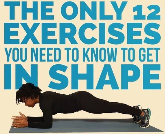
Image – Buzzfeed
This example (above) is not really a “Pinterest image” (it’s not tall) but this one did SUPER well on Facebook. The wording is AWESOME. This is just how you should do the words for Pinterest. I rate this wording 10 out of 10. A textbook example. See how it fills up the entire space, has great color and grabs your attention in just the right way. See also how the most important words are BIG, speeding up comprehension and making it “bite sized”.
The image choice too is awesome. It features one of the 12 exercises, makes you want to check the other 11. Also the model is doing the pose well, and looks stylish in their black workout clothes. The whole thing is cool, cool, cool. Buzzfeed are of course Grand Masters of the social media game and success isn’t an accident…
Next (below) is an example that is “not bad”. It got 1k repins. Nice big words that hit you right in the face – check. And some useful info. But… their color scheme is… kinda ugly to be honest… really no sense of style lol. Super uninviting bare concrete wall. Also, I would have put the numbers in each image, i.e. 1 – Downward Dog, 2 – Cat Pose…. so people can see 1,2,3,4,5 and then click because they want the other 4. Put the numbers in nice little colored circles also. People love things that don’t involve “mental gymnastics” to figure out what is going on.
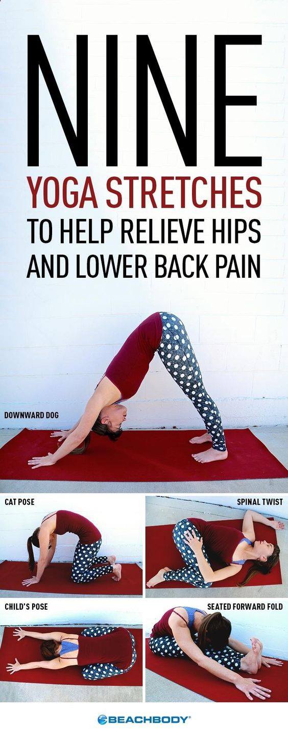
Image – beachbodyondemand.com
Now this one (below) is better. It got 4k shares.
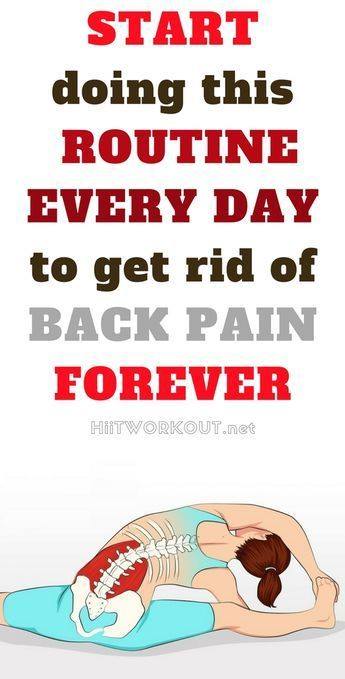
Image – hiitworkout.net
People love simple hand-drawn illustrations and in the health niche especially, simple “anatomical” style images of the body (or the parts of the body relevant to the post) are a proven winner. The overall colors here are nice. I still think the words could have been even bigger! But this is definitely on target – a winner.
Now apologies to the creator, but this one (below) is a true disaster, can you see why? So many reasons….
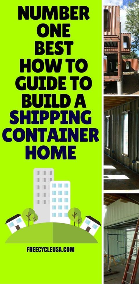
Image – freecycleusa.com
It grabs your attention, but, it does so like someone throwing a drink in your face. First, that headline is a verbal train wreck. You are reading it and thinking huh??? “Number one best how to guide to.“ What???? Did they really write that and think it was good? It’s the most clumsy wording ever! Also their phrase grouping is non-existent.
There are many other things wrong with this picture. Their graphic has poor layout, truly horrible color choice… and the funny little skyscrapers and houses have nothing to do with containers also. Also, their photos have literally ZERO appeal. Not only are they ugly (compare this junkyard with the amazing sparkle in the container homes in the winning pic from homebnc.com and ask yourself “Who on earth would want to live in one of these rusty old boxes?”) – but also, they have cropped the photos terribly so you just can’t even see what is going on there anyway. They are failing at social media. This graphic was done by a rank amateur, not a professional.
Sometimes “work in progress” pics can add interest to a graphic – but with recipes, DIY crafts and other creativity-oriented niches, a big “showpiece image” of the finished product should be front and center.
Learn From Your Data
As with all things social media; if you create a batch of new graphics and pin them, you will most likely find that some will flop, most will perform “somewhere in the middle” and a few will blow the others out of the water.
Quite often, you won’t be able to predict which posts will be the super strong ones. But then when you review the statistics, you can take note of which of your posts did best – and start to interpret why. This is absolutely key because it enables you to improve your skills. Study your analytics and learn from the data, so that you can do more of what works. You can also learn a huge amount from looking at the stats of other blogs.
This process of refinement is ongoing and you will improve over time – but you will find (I still do after 8 years) that the performance of your images can catch you by surprise. Typically when I get a “unicorn” image that generates mega shares and viral traffic, it was unexpected – however overall, you will become more consistent and your chances of hitting that bullseye viral image increase.
Keep learning and keep going – because, put simply, the more darts you chuck at the dartboard, the higher your odds of hitting the bullseye (especially if you learn from your shots as you go along).
You will find that after you have made thousands of graphics, you will be a reliable sharp shooter. It’s also fun to look back at your early attempts and see all the ways in which you have grown.
Another benefit of having a large image portfolio is that you will naturally end up with a higher number of winning cards in your hand – that you can re-play whenever you need a traffic boost. “A viral image is a viral image” – and in many cases can continue to generate good traffic even if re-posted years later! There are certain viral images of mine from the old days (2013) that still generate good traffic whenever I post them!
This phenomenon is interesting. You would have thought that “everyone would have seen it by now” – but that’s not the case. The world is big. Even if your post gets a million views, that means only about 1 in 7,000 people has seen it: Try posting it again a few months later – I bet it does well all over again. 😉
Learn From The Data Of Others
You can learn a huge amount about “what works” by looking at the statistics of other accounts! You have to know which stats matter, though. For Pinterest, the number of “monthly views” is the key metric when it comes to traffic and this gives a fairly reliable indication of how much traffic is being driven by that account. You can see the monthly view count on the home page of any Pinterest account.
Pinterest caps the “maximum” displayed monthly view count at 10m+ and so to see which designs really work best, dig around in Pinterest and make a list of accounts that have 10m+ monthly views. Then go to their “created” tab and check out their designs.
If A Design Is Performing Well, It’s Ok To Use Similar Layouts And Styles For Multiple Posts
Looking at Pinterest accounts that have a high number of monthly views (in the millions) you can see that quite often, they use the exact same design / layout / fonts / color schemes for multiple images, or even for all of their images! This doesn’t seem to be harming them at all! So, once you hit upon a winning design that gets noticeably better traffic than your other graphics, try making lots of images in this style. Interestingly also, this can have the effect of “brand recognition” of that style, which is very desirable – as well as speeding up the process of creating new Pinterest graphics! 🙂
I would suggest to try developing a number of different styles until something performs visibly better than your other designs (keep an eye on your blog analytics to see which posts are getting the most Pinterest traffic) – and then try replicating that design with new headlines and unique imagery. Canva has a super-useful “Make a Copy” function (in the “file” menu) and this can be used to duplicate an existing image, which you can then edit to use for a new post.
Image Licensing: Should You Use Free Or Paid Images?
While “free image” sites such as Pixabay, Pexels and Unsplash give tons of amazing, usable “CC0 / Public Domain” images that you can incorporate into your graphics, numerous Pinterest pros now advise against using these – and my own research agrees.
The reason is simple: They have been massively over-used. Pinterest’s algorithm gives a visibility boost to original content. The vast majority of people use Pixabay / etc “free” images – and these will have likely already been used on hundreds or perhaps thousands of Pinterest graphics.
It’s widely agreed that you will notice a significant bump in the traffic generated from your Pinterest graphics when you stop using Pixabay / Pexels / Unsplash and other free image sources. My best performing pins ever have used either “paid” licensed images or images coming from uncommon, less well known sources…
So for best results, either take your own photos or license images from one of the “pro” image licensing sources such as Shutterstock or Adobe Stock. I love Shutterstock – they have tons of incredible images and if you purchase a monthly plan (you can always cancel before renewal) you get the best deal. So I tend to wait until I have a big batch of content that needs images – then buy a monthly plan, download the maximum amount and cancel before the renewal date.
Note – doing simple Photoshop processes to Pixabay images to try to “fly under the radar” of image uniqueness, probably won’t work. I tested this, using a Google reverse image search (which uses similar technology) and found that ‘flip horizontal’, resize, hue/saturation adjustment etc makes no odds, the image is still picked up. I had to really “smash” images to get them to beat Google reverse image search: “Inverse” (which creates a photo-negative) works but is not usable for the majority of photos because it looks terrible. Saving as a PNG with massively reduced color spectrum (i.e. down to 2,3 or 4 colors) also works and can look attractive, so this could possibly be utilized for some imagery.
What I just wrote will make sense if you are a Photoshop pro. All the above is time consuming and fiddly. You might as well just license an image or take a photo 😉
Pro Trick: Multiple Pinterest Images Per Blog Post
In order to generate mega Pinterest traffic, your overall long-term objective should be to build up a large number of usable images and to be pinning consistently both to your own boards and to group boards.
Each of your blog posts should have at least one “Pinterest image” – so focus first on making one great Pinterest image for each blog post. Once you have read this tutorial you may find that you want to revisit your old blog posts and create new images for them – and that’s fine! New images can breathe a new life into old posts.
Some Pinterest pros however create 5 or 10 unique images per post – especially for the most successful posts! But make sure you are getting things right before creating lots of images for one post.
A great strategy is to look at your blog analytics and create additional Pinterest images for your best performing posts. Note that (thankfully) these images don’t all have to appear on the blog post itself – as you can pin an image directly to Pinterest and then specify the URL you want the image to link to. These additional images can also contain both headline variations and totally new design elements; which gives you further opportunities to “split test” different styles and note which ones do best.
Keep Your Materials Organized
You need to tailor your graphic sizes to each social media site because they all have different requirements. So you will probably find that you end up with a custom version of the graphic for Pinterest, one for Facebook, one for Instagram, one for your Youtube placeholder, and so on.
You will find that you need a well-organized system to prevent things descending into chaos! 😉
I keep ALL the “bits and pieces” from each blog post – article, images, source material, PSD files – in the same folder, and the images are labeled systematically – for example shipping-container-FB.jpg (Facebook image), shipping-container-PI.jpg (pinterest image), shipping-container-IN.jpg (instagram image).
Keep a copy of everything in a folder and keep it organized with “Photoshop PSDs”, links to the Canva files online and other elements intact, so that you can go back later and edit if needed. And make a backup!
It’s great to be able to return to old graphics later and make changes as needed – and I will bet that you WILL need to do this at some point. It’s a real hassle to have to re-create it all again from scratch because you lost your .PSD file and all the source imagery. A coherent naming and folder system will be your friend in the long run – and make sure that everyone on your team sticks to the same protocol.
Don’t Steal Images!
SUPER IMPORTANT! Aside from attracting DMCA takedown orders and potentially Pinterest account closure, there are now really serious consequences coming down the pipe for image thieves. Even if the image was posted on your blog ten years ago… even if you didn’t know it was a stolen image… I am 100% serious. The hammer is falling in a big way when it comes to image theft. This is happening right now.
There are companies that are filing mass legal actions (thousands) against image thieves and these guys play hardball. If you get one of these legal threats, it can result in a grim choice to either settle out of court for perhaps $500 to $1000, or face court case with a potential $20,000 fine. This is not a set of choices you want!
Avoid stealing images, and keep track of where every single image comes from that you use on your blog. If you don’t know where an image came from or whether you are cleared to use it – don’t use it. It’s that simple. Keep a note of the URL of the image source. If you got written permission, screenshot it and keep it in the folder with your post.
You will thank me later for this, I promise you! Note also that if you hire freelance workers, you would very likely still be legally responsible if they steal content and you publish it on your website. And “But I thought it was Public Domain!” isn’t gonna cut it as an excuse. You don’t need to take these kinds of risks!
Your Best Stuff Will Probably Get Stolen…
… and it will drive you crazy. They will scrub out your logo, and redirect your graphics to their own (typically spammy) pages. It’s infuriating – but it happens at mass scale. I’ve had my images stolen literally thousands of times – and in my experience, Pinterest won’t do a thing unless and until you file a DMCA takedown request; then they will strike down the stolen content because DMCA is a form of legal action; they are required to. So periodically, you might wish to scan through your keywords on Pinterest, and use “report pin” for stolen content to be taken down. It’s a tedious job though – and the content thieves only get away with it because people are too lazy or busy to file complaint. You can also assign this task to a VA but just be aware that it is an ongoing game of whack-a-mole. You may find it better to simply “invent faster than they can copy”. My intuition is that the image thieves are about to get hit so hard with legal actions that they will scatter in terror – and it will put a stop to it. We will see…
Tall “Pinterest Images” Don’t Really Work Well For Facebook And Other Social Media Sites
All the various social media sites have an optimal image format that works for their platform. For best results, you’ll need different versions of the graphic for the various platforms.
For example, while “tall” images are best for Pinterest, these don’t work so well on Instagram (they get truncated – potentially cutting off important info) – you will want square versions of your images (i.e. 800×800 or 1080×1080) for Insta.
Facebook? It has its own quirks: I would advise 2 images – a “flat” 1200×628 version for “link posts” and a square or “slightly tall” (but not as tall as Pinterest images) for image posts. I know, its a bit annoying.
If you are adding your graphic to your blog post (recommended!), don’t set a “tall” image to be the one that is scraped by the “Facebook debugger”. Otherwise, FB will cut off most of your image and this will negatively affect the clickability of the resulting Facebook post. The Facebook Debugger tool will show you which image Facebook is pulling when someone drops your link on Facebook. You are better off with a “flat” image being pulled by FB, so nothing is cut off. In other words, create a different version for Facebook link posts that is of the size ratio 1200×628. You can set the FB image either with the Yoast SEO plugin Yoast SEO plugin (WordPress) or with the “og:image” tag (HTML). Then run the debugger again to refresh the pulled image to your new one. There’s a bit more to it than this but that’s outside the scope of this tutorial.
That’s it!
Now go crush it on Pinterest and have fun doing it! 🙂
Staxxx